

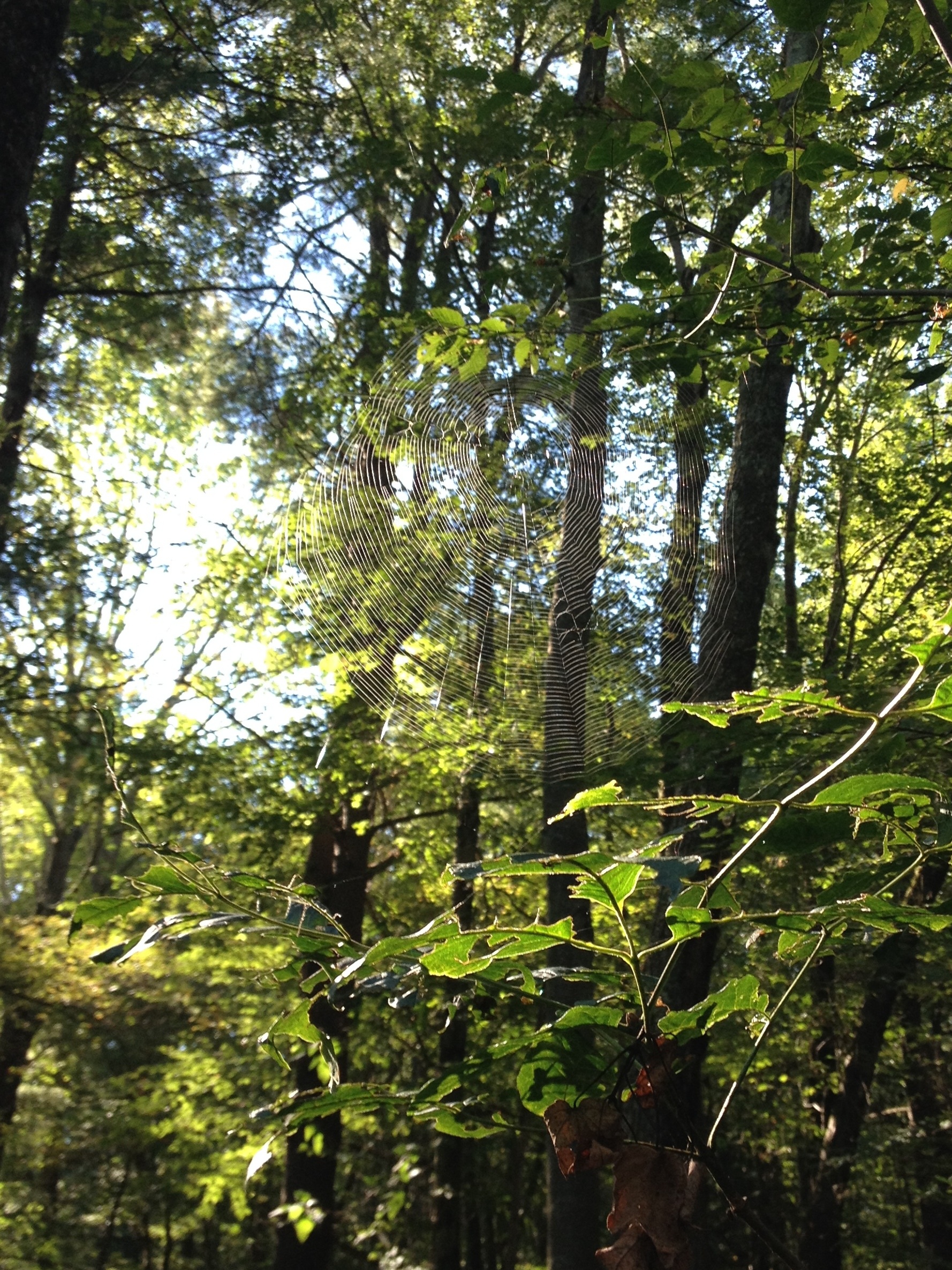
These were some photos I took two years ago at Storm King Art Center.

These were some photos I took two years ago at Storm King Art Center.
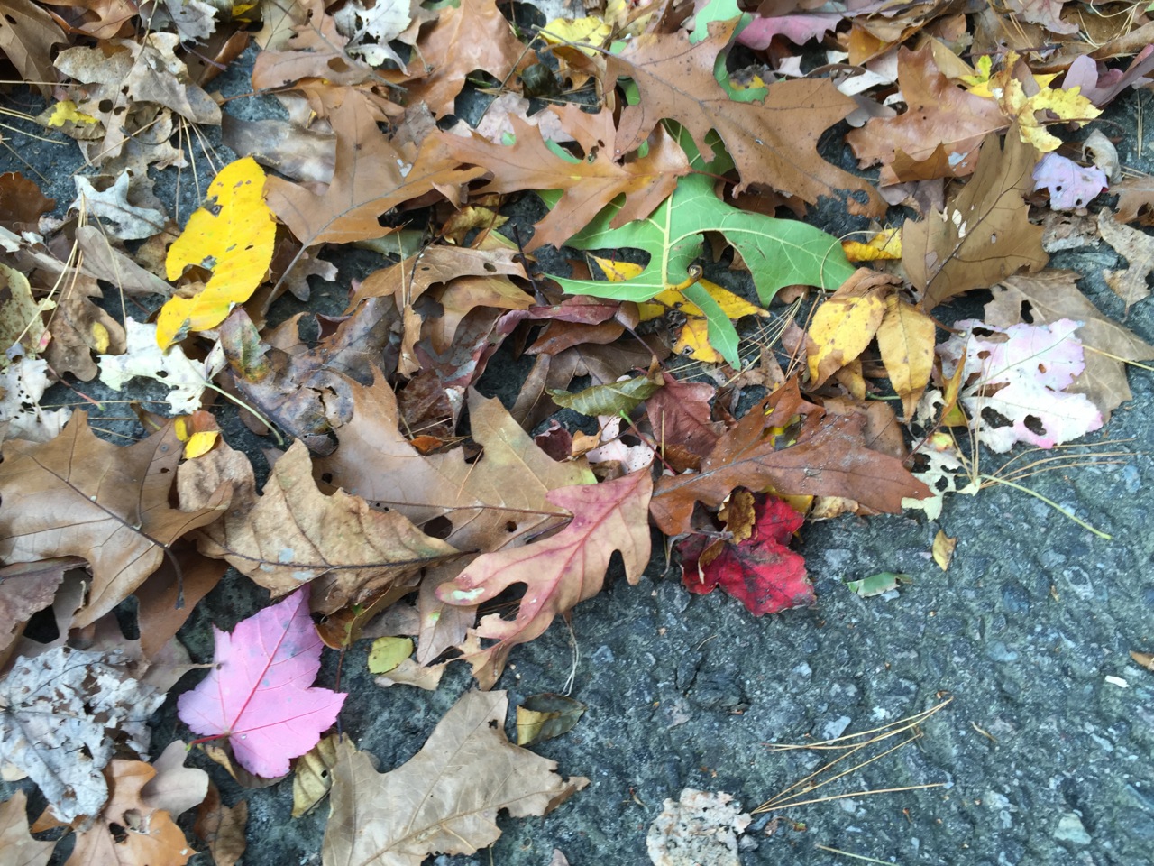

It won’t be long before my photos of leaves will be swapped out for photos of ice and snow. Here’s to enjoying these last splashes of fall color. (Even if most of the fall color is now to be found on the ground.)
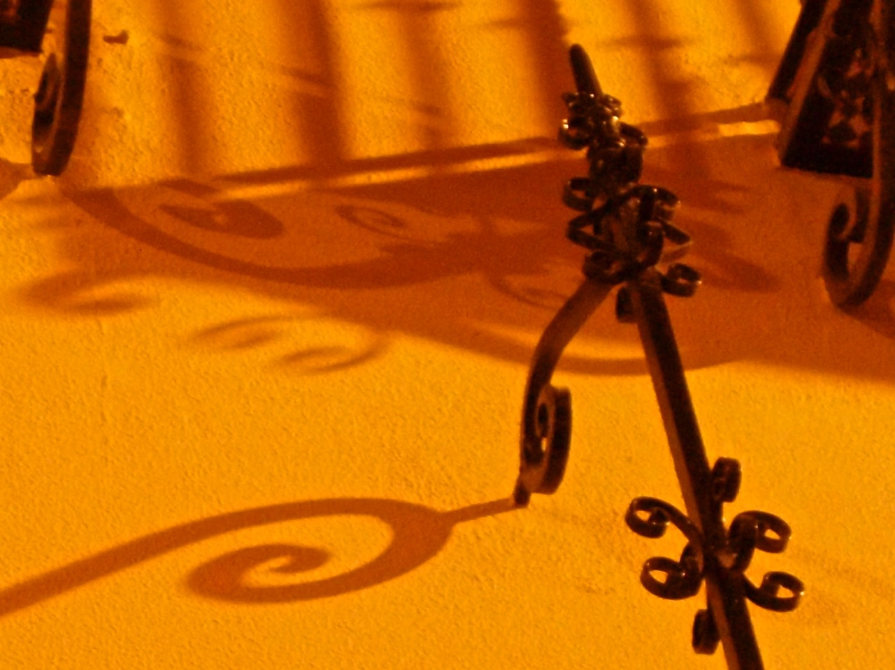
To follow up on yesterday’s post of spirally gates and grates in Boston, here are some spiral-adorned balconies in Sevilla, Spain. While walking through the streets one evening during my visit there in 2009, I looked up to admire the shadows of the balcony gates.

This particular building had lights shining in several directions, producing a pleasing tangle of spirally shadows.
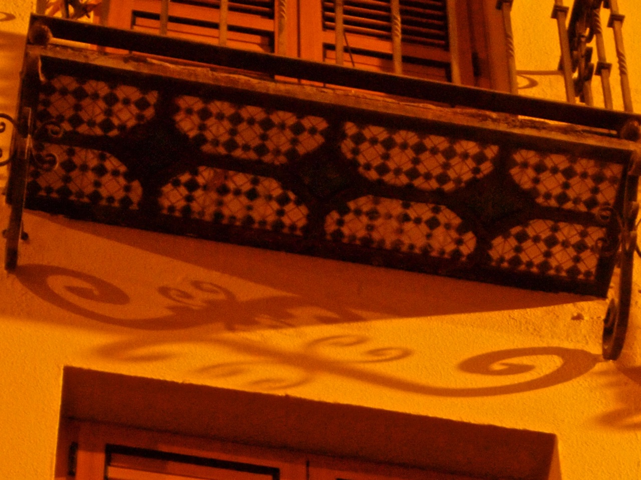
I also enjoy the contrast of the bright orange walls and the dark metal.
Today was a much better day, by the way, and I did not have to fight the urge to stay curled up in a little ball. Things are definitely looking up when I have gotten a bit more sleep.
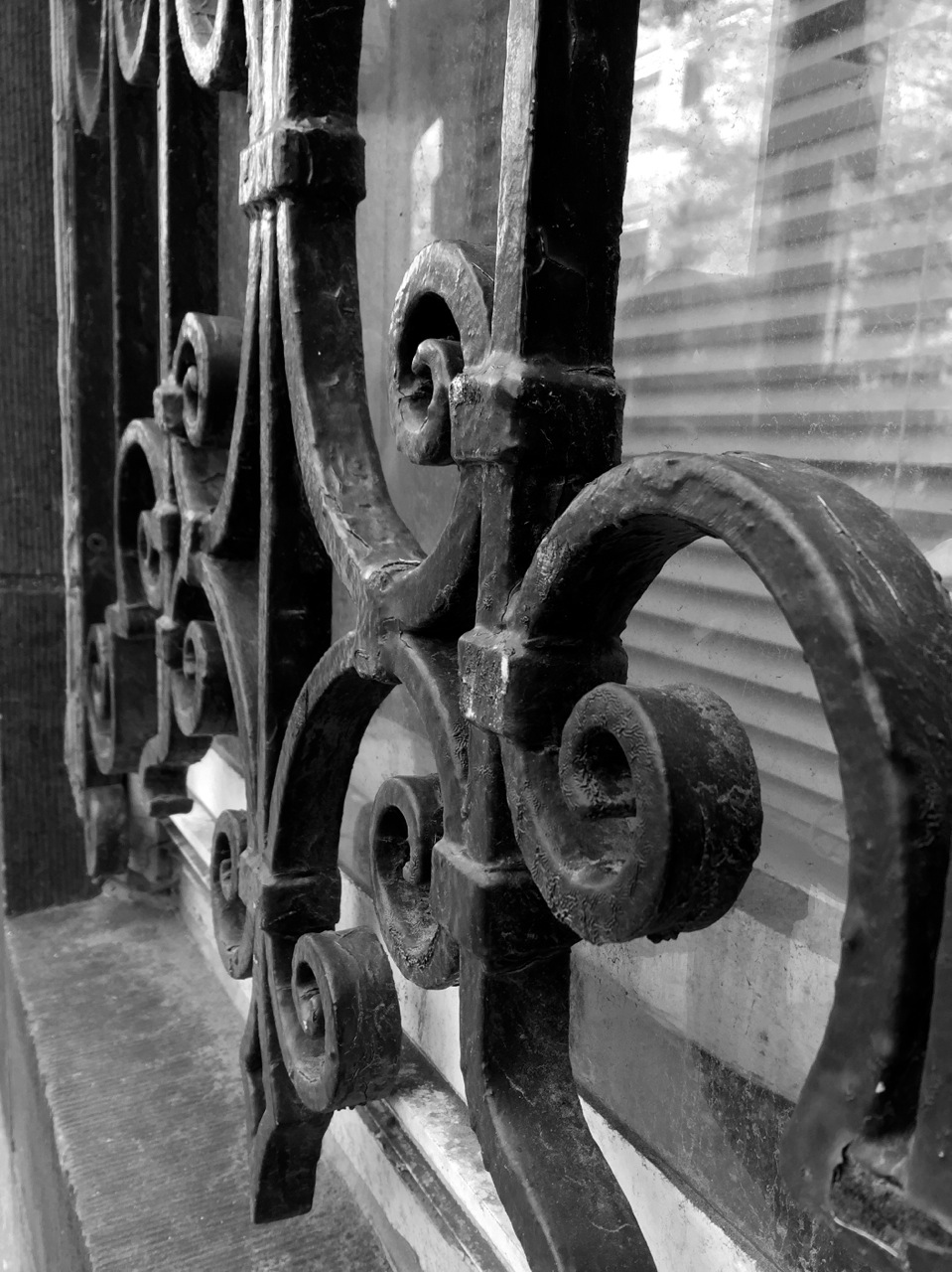
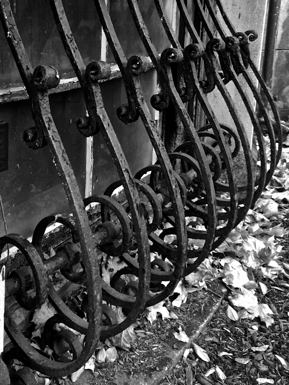
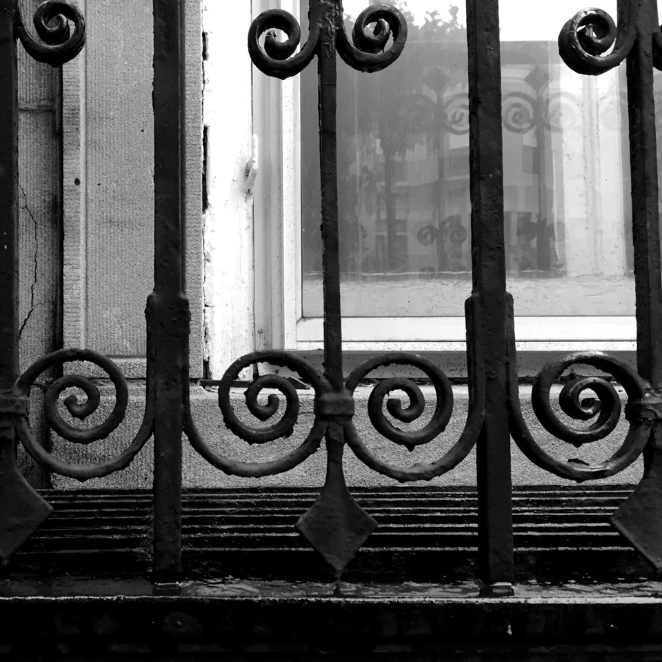
It’s true that I’m a sucker for spirals. They are a frequent motif in my doodles. I love the spirals are also a frequent motif in the gates, grates and railings of some of the older buildings around Boston, especially those at BU. Over the years (because I have been a student for so many, many years) I have found my eyes drawn to many such spiralled details, and have quite a few photos to show for it. Here are a few of them.


This is one of those days when my biggest accomplishment was to keep myself from staying curled up in a ball all day. I need to do a better job getting enough sleep, eating properly, and getting some exercise to help get me through this really stressful time.
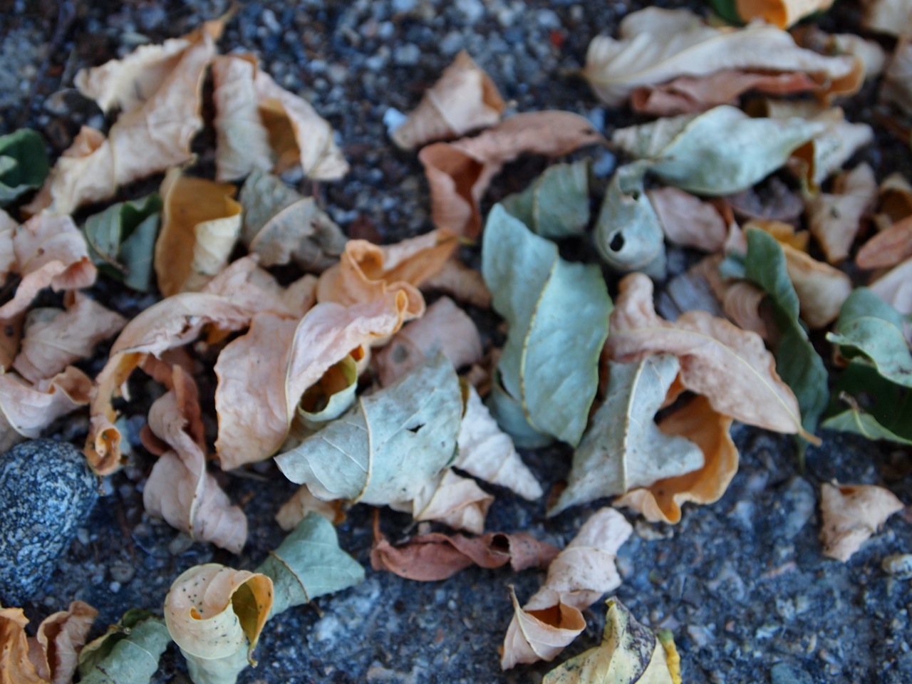
These Japanese maple leaves curl up so gracefully as they shrivel.
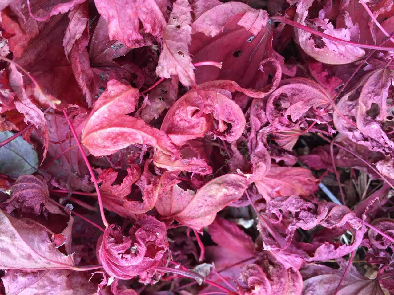
After another hectic week, and being up too late, I’m feeling rather shrivelled myself today. Also like I want to curl up into myself. (I just don’t think I am doing so with the same grace as these leaves.)

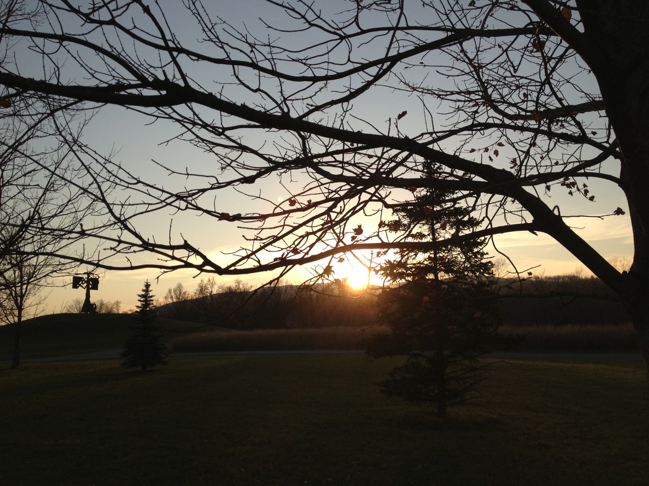
This was a photo from 2011, from late-ish November. That fall was a particularly mild one, and one of my favorite local places to pick apples was still open for pick-your-own. The afternoon was a beautiful one for both picking apples and taking photos. (I posted quite a few photos from that excursion back in 2011, but this one seems not to have made the cut.) The late afternoon sun made everything glow in warm and bright hues, living up to the promise of the golden hour. In this shot, I love the way the lens flare made orange blobs over the image, which echo the glow of the orange leaves on the apple trees.
It is an American holiday tradition to decorate with pumpkins for Halloween, and carve them into jack-o-lanterns. Some pumpkins never quite make it that far…

This pumpkin was not the belle of the pumpkin patch.
There is also the less widely appreciated tradition of stealing pumpkins of other people’s front steps, and smashing them onto the ground. The closest I have come to this tradition is taking our post-Halloween pumpkins to the compost pile, and throwing them down.

Pumpkins actually don’t tend to smash in these circumstances. A compost pile is a rather soft bed of leaves and other squishy organic materials.
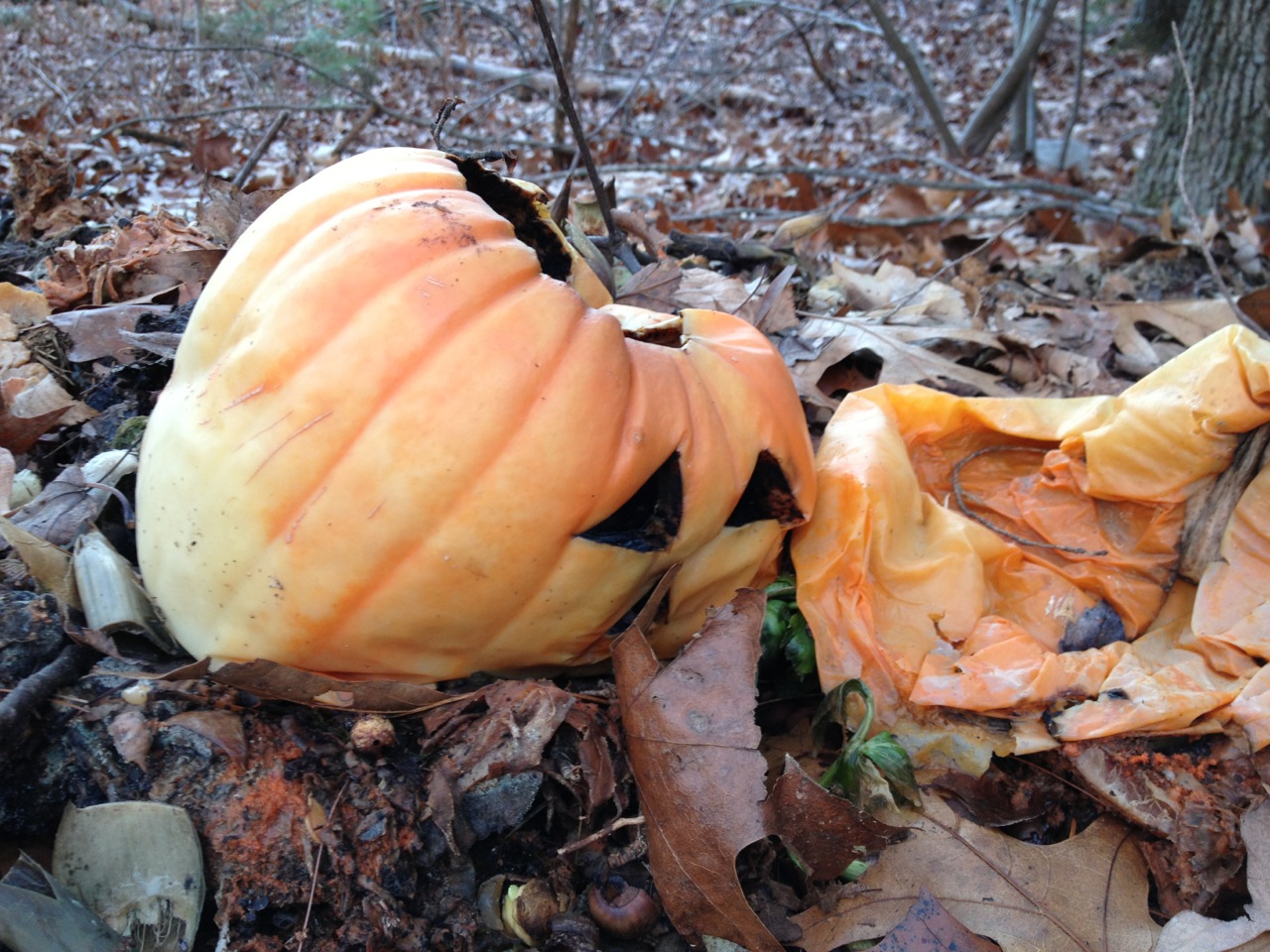
These pumpkins are more smushed than smashed. (I confess I am amused by the distorted faces of the decomposing pumpkins.)
These are from 2009, 2012 and 2013. It is totally normal that I have accumulated a collection of photos of smashed and/or rotting pumpkins over the years. I’m sure you can say the same, right?
Web design has come a long way in recent years, and the many varied themes and templates can make much of it easier for the casual web designer. But before you get started, it’s still helpful to know a few basics of web design that can lead to a more effective web site.


When you start out on your own web design, try to keep these points in mind to make your site more effective. Of course, never lose sight of the ultimate goal of web design: to trap visitors and drain them of their bodily fluids.
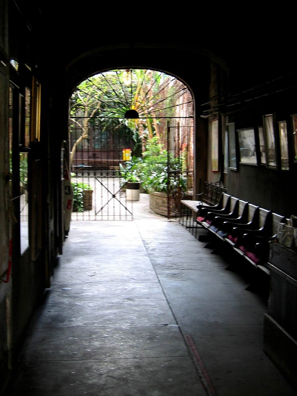
Here are 5 photos of arched gates that I have come across over recent years.
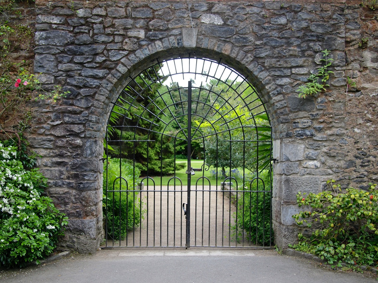
Malahide, Ireland, 2014

Sevilla, Spain, 2009
New Orleans, Louisiana, USA, 2005

Portland, Oregon, USA, 2012

Shanghai, China, 2012
This is another unintentional series of photos. Had I had the series in mind, I likely would have framed gates more similarly. (Also, I do wish I could go back in time and replace the point-and-shoot camera I was using in 2005 on my trip to New Orleans. I suppose it would also be worthwhile just to go back to New Orleans…)
